While I do have various social media accounts, I’m not equally active on each of them and less attentive than I used to be to all of them these days. One reason being that they make it increasingly hard to simply see what I want to see. As such I became aware of a sticker design contest only several days before its deadline. Lasting for a month, without a limit on entries as long as they were unique, I would have liked to enter several designs to increase my chances for winning one of the prized top 5 spots, […]
Continue readingTag: art
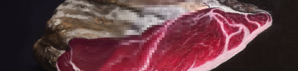
When Digital & Traditional Meats
While I’ve done quite a bit of digital painting in recent times, my acrylics had been patiently waiting for me to give them the time of the day. Not because I don’t enjoy using them, but there’s more friction to get going and when the end result is primarily shown on a screen anyway, it’s easy to reach for the stylus in front of me over setting up an easel, brushes and a palette. About a week ago however, their moment had come. A friend from overseas told me about his upcoming visit to Vienna and we made plans […]
Continue reading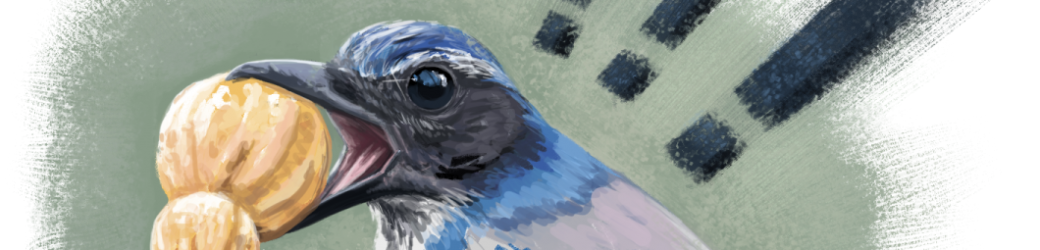
Doing it wrong to get it right.
After my two recent digital speedpaintings, I started to wonder where to take things next. As fun as doing very time limited studies was, once I’ve proven to myself I can do something successfully, I always begin to feel like trying something new or do it differently. As coincidence would have it, my trusty Twitter feed was right there, ready to help me out once again. My friend and one of my favorite photographers Cri, tweeted a photo of a Scrub Jay happily displaying a freshly acquired peanut. It was the perfect image to try something I’ve meant to […]
Continue reading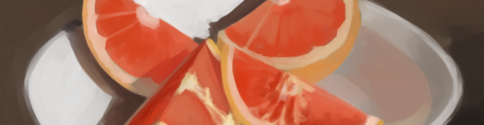
Recreate & Re-Create
As is too often the case for me, I tend to forget how much I enjoy doing something (or the satisfaction I get from the result) after not having gotten around to it for a while. This time it was painting studies. I had no idea how long it had been since I made my last, but when I saw a photo of cut up, deliciously lit grapefruit in a bowl over on my Twitter feed, I knew I had to paint it. Now I have to admit that I’d very much prefer to have a go at it […]
Continue reading
Of Heart & Sap
With most of my recent work happening on 3d models, woodwork especially has taken a back seat for a long while by now. The want to return to craft a new piece is rising, but in the meantime I’ll use the opportunity to highlight my previous works here, starting with the Marriage Box and how it came about. One day, I received a surprising letter in my mailbox. A friend of mine from a faraway country had invited me to his wedding. Sadly my lack of funds prevented me from going on a journey to attend their union myself, […]
Continue reading