While I do have various social media accounts, I’m not equally active on each of them and less attentive than I used to be to all of them these days. One reason being that they make it increasingly hard to simply see what I want to see. As such I became aware of a sticker design contest only several days before its deadline. Lasting for a month, without a limit on entries as long as they were unique, I would have liked to enter several designs to increase my chances for winning one of the prized top 5 spots, but there was still enough time to flesh out one at least.
Flesh out indeed, as my first go-to when it comes to doodling is anything but fleshy and when the topic is “Creepy Head”, reaching for the comfort of a skull was almost a given. Being content with something as simple would be a rather boneheaded move however and could hardly be called design, let alone wow judges in a contest. On the creativity scale it would rank just as low as using a spider when the topic is creepy crawly. But what if we combine the skull with that spider? It does make for a more complex idea, yet still has been done numerous times before and wouldn’t be enough by itself to clear the hurdle of originality either.
While churning all this in my head, I suddenly realized that there might be plenty of skull spider designs out there, yet I couldn’t remember seeing one where legs emerged out of the teeth’s sockets, with those instead being the very tips of the arachnid appendages. I began to visualize such in my head and put down a sketch onto virtual canvas.
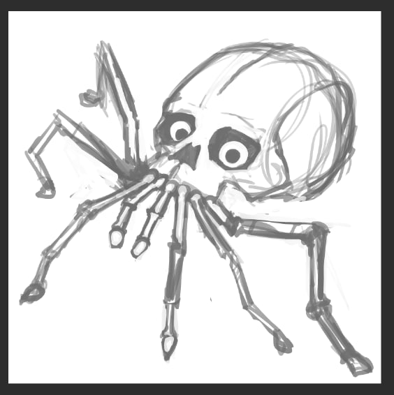
Though I wasn’t unhappy with my scribble, I wasn’t really sure of the direction and look either, so I asked friends what they thought. Was it creepy? More importantly, did it transmit the core concept of the teethlegs that were meant to set it apart from your run off the mill skull spiders? Considering I had to point that feature out to them, the answer was clearly no. Back to the drawing board.
Admittedly, no matter how objective and justified critical feedback on a design is, there’s almost always a sting of disappointment hurting the part of you which created that thing. Once you get over that however and given that the criticism was valid, it can spur on your creativity and lead to a much improved result. “I think you can do better” and right they were.
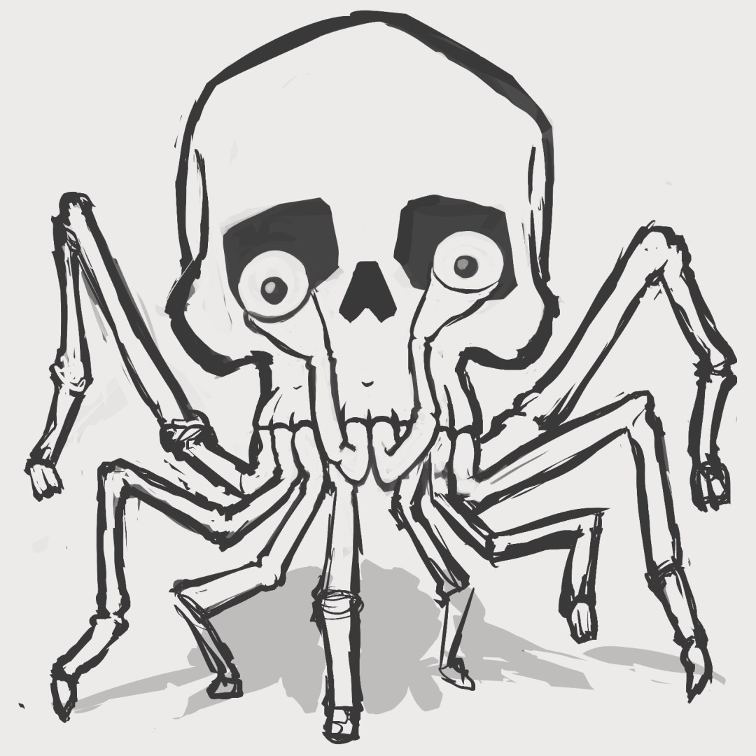
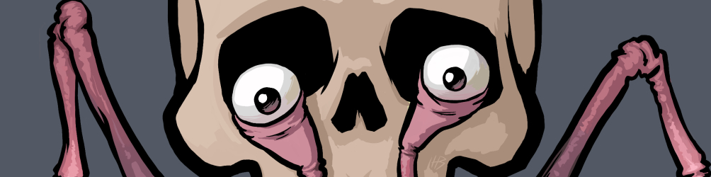
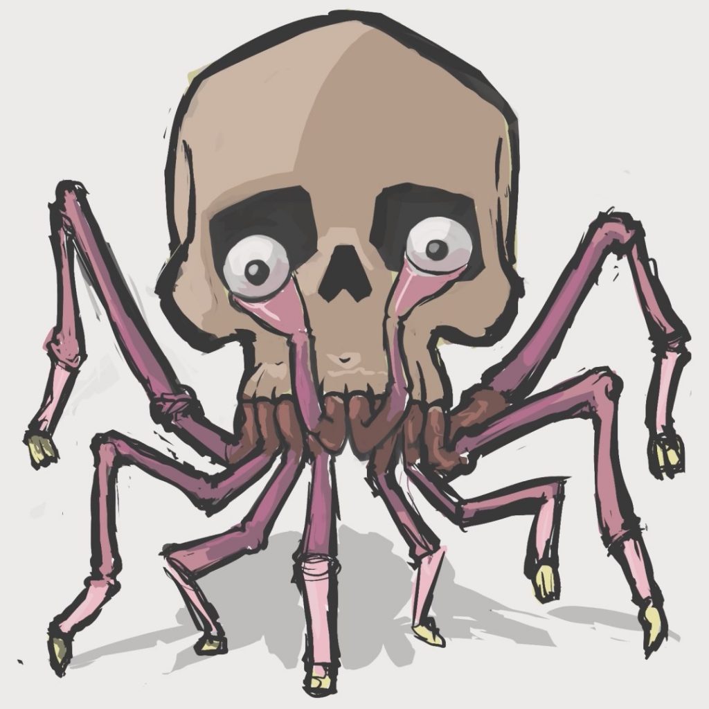
The idea behind the first design was to make it look like the spider would sit on whatever you put the sticker on and while I’m sure there’s a way to make that work, the perspective and resulting foreshortening coupled with the division of elements and space would make the important parts very small, hard to read and waste quite a lot of area in the required square sticker format as well. Instead of clinging to that, I opted for a switch of viewpoint which brought along the spark for another improvement of the concept. Instead of only legs, I would also incorporate a spider’s pedipalps to carry the eyeballs. The front view might result in a more flat look, but at the same time allow for much better composition, readability and filling the available space without overlapping and tangling up all those legs. On top of that, the loss of depth could be offset through use of colours and shading to a big degree anyway.
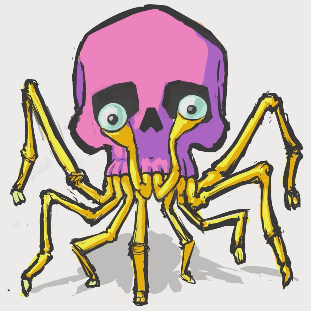
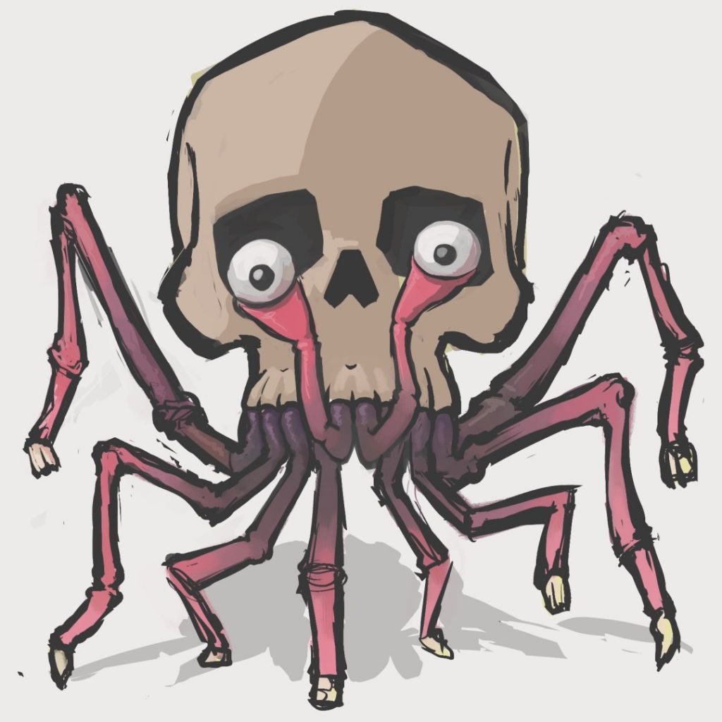
Which brings us to the next step, colours. Before refining and cleaning up the lineart, I wanted to see how the head would look in various palettes, so I quickly threw on a few, including a bonus neon scheme, because that would have definitely existed in a sticker set in my childhood. Not remotely scary, but still cool in its own way. Once again I asked friends what they thought and again it helped steer me in the right direction. The pale pinks were more well received, with saturation seemingly reducing the creep factor.
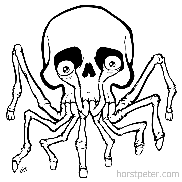
Preliminary colour considerations left to stew in my head, I moved on to finalizing the line art. The goal of course being to achieve a clean, yet not sterile look that supplies interesting shapes and forms that feel full of life.
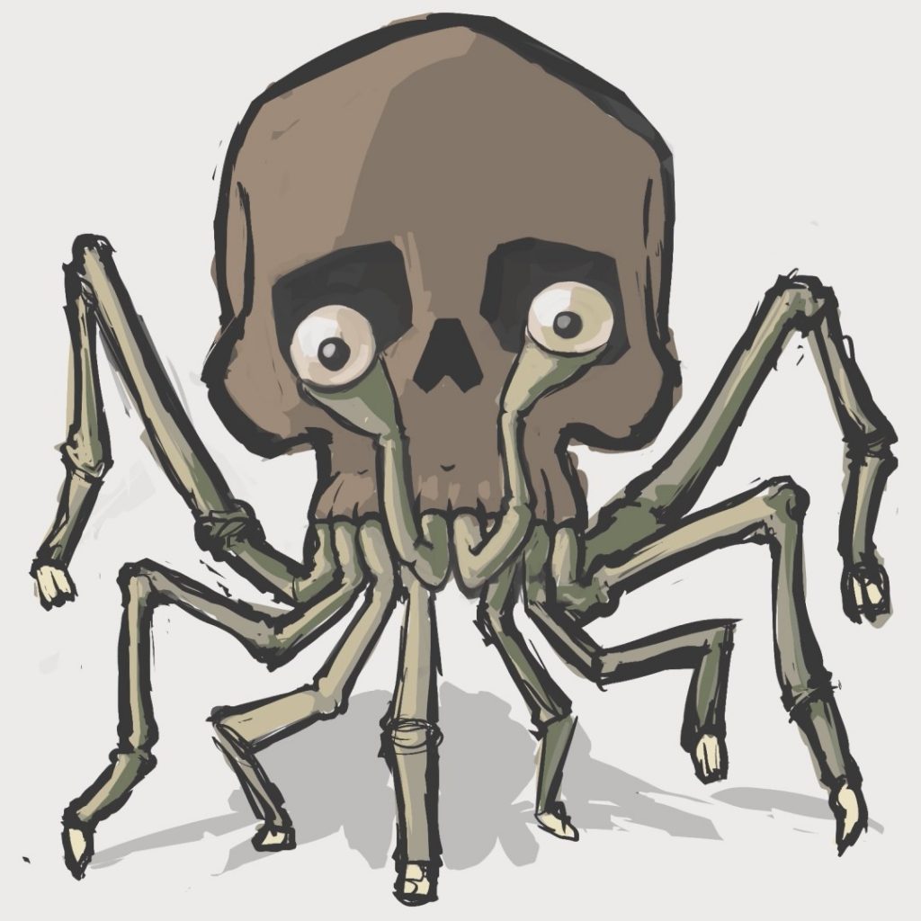
Digital inking done, it was back to colours. Going with the lighter, less saturated pink tones for the legs definitely felt right, but to add the feeling of depth mentioned earlier, applying the darker tones from the other colour test towards the roots of the appendages was the way to go. Some simple shading helps to establish the forms and add a bit of texture through squiggly highlights or transitions between light and dark. Self-shadowing of the eyestalks onto the skull does its part in the illusion of depth.
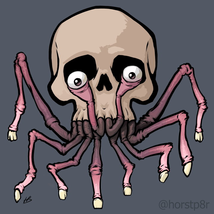
Shadow is also the keyword for the last step. To make our head look like it is occupying actual physical space, it needs to cast a shadow. Two types of shadows to be precise. Dark small contact shadows where the feet touch the ground or are very close to it, with a lighter shadow for the combined big form, falling onto the floor in a direction the shading would suggest. Rough estimates are usually enough to make it believable and I decided to give it some skittish edges implying odd movement and coupled with the slightly lifted leg, maybe an uneasy feeling of the head bursting into full motion at any moment.
If you like to see the process in action, here it is condensed into 30 seconds:
If you enjoyed this article and would like me to write more of its kind, you can support and allow me to do just that over on ko-fi via that fancy floating “support me” button on the left or go and buy something from my store here.
Thank you,